
Embroidery 101
Thread Colors & Fonts: How to Choose
18
Oct
Oct
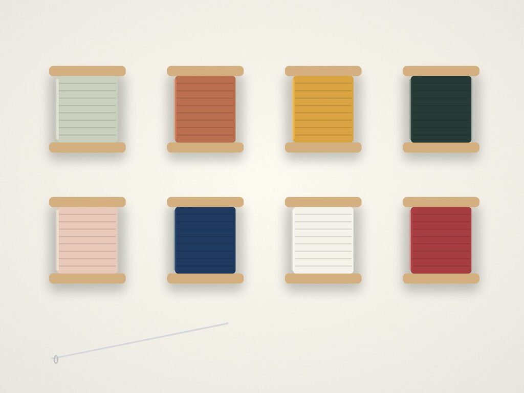
Thread color and font decide how your embroidery looks from across the room and up close. A few rules make the choice easy.
Pick contrast or go tone-on-tone
High contrast, like cream thread on forest green, reads clearly. Tone-on-tone, like navy on navy, is subtle and modern. Both are great, just choose on purpose.
Match the font to the size
Thin or very ornate fonts can lose detail when stitched small. For small lettering, choose a simple block or rounded font. Script fonts work best when they are a little larger.
Keep text short
Names, initials and dates stitch cleaner than long phrases. If you want a longer message, ask us about placement and size.
Always check the proof
Every personalized order includes a free digital proof. Read it letter by letter before approving.
See the full Personalization Guide.
